Kweiseye is an art criticism blog written by Tom Kwei. If you enjoy this article, browse the archive HERE for more than 60 other critiques of both artists and exhibitions. Any questions/queries/use: tomkweipoet@gmail.com.
Painting is but one of the skills that sculptor, photographer and installation artist Bruce Nauman also has at his disposal. In spite of his myriad of approaches though, there runs an aesthetic minimalist consistency throughout his work. A stoic adherence to precision, with a direct eye that conjures deep juxtaposition puzzles for the viewer within subtle signifiers.
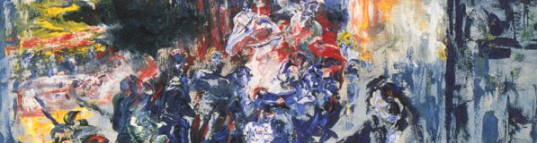
NO (1981)

The sheer power of words is never better exemplified than in Bruce Nauman’s ‘NO’. The painting is a smart flip on the idea of patheticfallacy, with the chaotic weather of the piece not just representing the idea of the word ‘No’ as a concept, but also incorporating the slick contours of the word itself within the maelstrom. The word charges out from the front, the stormed techniques curving around the contours.
Regardless of the term however, the work throughout is outstanding. Though on first glance they may feel as childish scribbles, there is a consistency to the manic scrawls; spirals tube up and out of the words, small twisted tornados gather in arches, the guttering white at the left hand side of the ‘N’ of the word gifts it a seething, searing quality. Around this depiction of solid refusal there is still some of Nauman at work, with a clean white boundary left around the word, adding a caustic edge to the denial.
Though undeniably powerful even just on the screen in front of you, experiencing’ NO’ in real life, as I did when staying in Liverpool, really allows you appreciate the power of the painting within the context of a gallery. Scanning the upper room of the Liverpool TATE where the painting is housed, it will always catch your eye with monomania.
Ultimately, there comes a sense, especially with ‘NO’, that perhaps analysis as per Kweiseye isn’t even necessary really for this one, its powers self evident and without question.
Ah Ha (1975)

The title of this delicate mirror image piece is something you may initially mutter to yourself you dig deeper down in its symmetries. There is just not just the black and white of the left and right, nor the fact that opposing words, whose letters can each equally be halved exactly, are in fact the same reflection in both shape and spelling. The interest and trouble then stems from the fact that the definitions of the actual pure words themselves, the ‘ah’ and the ‘ha’ are hard to pin down in terms of empirical certainty.
‘Ha’ is obviously the easier of the two, the standard explanation being laughter, though perhaps it can be of malice. Is the ‘Ah’ an exhalation? A scream of pain? Perhaps it’s meant as mentioned at the opening, as an ‘Ah’ of discovery.
The standard tropes of this blog then, looking at brushwork, imagery etc. these cannot apply here. Yet the piece still retains interest through both the simplicity of its execution, and the effectiveness of the sheer idea of the thing. It is playful and suggestive, alluring in an unpretentious way. A nudge in the gallery to remember that defining artwork is treacherous. And if forced one should be taken by the glee of the situation rather than labored with obtrusive baggage.
Enjoy reading that? Click HERE to see a list of all the artist analyses on Kweiseye to date.
To keep up with the blog and all the art I write about, follow me right here on this blog or here @tomkweipoet


